
Accent Wall Color Ideas That Work for Every Calgary Room
19 May 2025
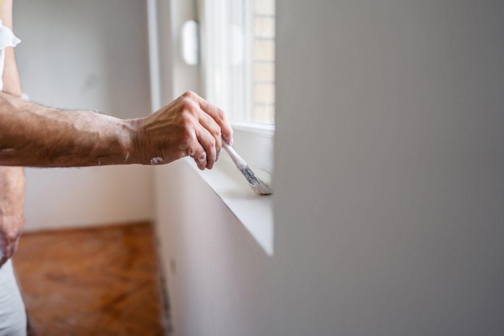
Why Now Is the Best Time to Paint the Exterior of Your Home in Calgary
27 June 2025 - Dow Brothers Painting LTD")
Why Color Matters in the Heart of the Home
We know the kitchen is more than a place to cook—it’s where families gather, conversations spark, and daily life unfolds. That is to say, the color you choose sets the entire tone of your home’s most used space.
Above all, Calgary families want kitchens that feel warm, functional, and welcoming. We’ve found that certain shades naturally encourage calm, focus, and togetherness. In the same vein, smart color selection can influence everything from appetite to energy levels during busy mornings.
Timeless Neutrals Still Lead the Way
We often recommend neutral tones like soft beige, creamy white, and light gray for kitchen walls. Most importantly, these hues create an open, spacious feel while letting cabinetry and countertops take center stage.
However, neutral doesn’t have to mean boring. To clarify, layering tones like greige or bone-white with matte finishes adds depth without overpowering the space. In addition, they pair beautifully with natural wood, marble, or matte black fixtures found in many Calgary homes.
Earthy Greens Are Making a Comeback
Many Calgary homeowners are turning toward nature-inspired shades, particularly muted greens like sage, olive, and eucalyptus. Consequently, these tones bring a grounded, calm energy into spaces that are often buzzing with activity.
For instance, sage green works exceptionally well on cabinetry or feature walls, balancing both modern and rustic design aesthetics. We’ve noticed that families appreciate how these shades soften the feel of stainless steel appliances. In other words, they make kitchens feel lived-in without looking dated.
Deep Blues for Depth and Drama
We’ve seen a rise in requests for deep blue kitchen tones like navy, midnight, and even storm blue. Therefore, if you’re looking to add richness or sophistication, blue is a powerful yet approachable option.
On the other hand, it’s essential to balance these darker hues with lighter finishes on counters and ceilings. Similarly, using eggshell or satin finishes can prevent deep shades from making the space feel too enclosed. The result is striking but still cozy.
Soft Pastels for a Fresh, Airy Feel
Lighter pastel tones are becoming more common in open-concept homes, especially in Calgary’s newer builds. For example, blush pinks, sky blues, and buttery yellows add subtle charm without being overpowering.
Certainly, these colors work best when paired with white cabinetry and plenty of natural light. In addition, they’re popular with families who want a cheerful, modern cottage vibe. We’ve seen this palette work particularly well in small kitchens, where brightness is key.
Warm Whites Are Always In Style
Classic white kitchens haven’t gone anywhere, but the trend is shifting toward warmer, creamier tones. As a result, off-white paint with soft yellow or taupe undertones is ideal for cozy, family-focused kitchens.
In the same vein, pairing warm whites with soft gold or brass fixtures elevates the entire space. We like to think of this combination as timeless yet trending—perfect for those who want a long-lasting look without compromising on style.
Accent Walls Can Transform the Mood
When we want to make a kitchen stand out without committing to a bold full-room color, accent walls are a great solution. To clarify, painting just one wall in a darker or brighter shade creates visual interest without overwhelming the room.
You might choose a splash of navy behind open shelving or a pop of terracotta near the breakfast nook. Subsequently, this adds character and warmth without the need for constant redecoration. You can view more options through our full list of interior painting services in Calgary.
Calgary Light and Seasons Influence Color Choices
We always consider how light behaves throughout the year in Calgary kitchens. During long winters, natural light is limited. Therefore, warmer tones like creamy yellow, soft peach, and dusty rose help maintain a welcoming feel.
In contrast, summer sun can make cooler colors feel especially crisp and modern. Likewise, north-facing kitchens often benefit from warmer hues, while south-facing spaces can handle cooler tones with ease.
We Help Match Paint With Cabinetry and Counters
Matching wall colors with existing cabinetry, tile, and countertops is key to creating a cohesive design. In other words, paint color should complement, not compete with, permanent kitchen features.
We typically bring a sample palette to every consultation to view how colors appear in your kitchen’s lighting. Above all, this ensures harmony in the final result. If you’d like to start a consultation, feel free to Contact Us.
How Calgary Families Personalize Their Kitchen Colors
Personal style plays a major role in every project we take on. Some homeowners lean into modern minimalism with black and white schemes. Others prefer a farmhouse feel, with dusty blues and distressed wood finishes.
Meanwhile, families with young kids often prefer bold accent colors like teal or coral to energize the space. In addition, these palettes work well for adding color without sacrificing function. You can also explore our range of residential painting options for more ideas.
Final Thoughts on Choosing the Right Kitchen Paint Color
We believe choosing kitchen paint color should never be rushed. It’s important to think about not just trends but how you live in the space. In conclusion, color should support your lifestyle, not just your Pinterest board.
Certainly, what matters most is how your kitchen makes you feel every day. Whether you choose timeless neutrals, bold blues, or calming sage, we’re here to help you bring it all together.
Frequently Asked Questions
What color is best for a small Calgary kitchen?
We suggest light neutrals or pastels to make the space feel larger. In other words, avoid dark colors unless used as an accent.
Can I mix more than one color in my kitchen?
Yes, two-tone kitchens are popular. However, it’s important to keep the tones complementary and balanced.
Do certain colors work better with stainless steel appliances?
Absolutely—cool tones like blue or green pair well. Likewise, neutral beiges and whites also blend nicely with steel finishes.
How do I test a kitchen paint color?
Use paint samples on poster board and view them at different times of day. That is to say, lighting changes color perception significantly.
What finish is best for kitchen walls?
We recommend satin or semi-gloss. In addition, these finishes are durable and easy to clean in high-traffic areas.


