
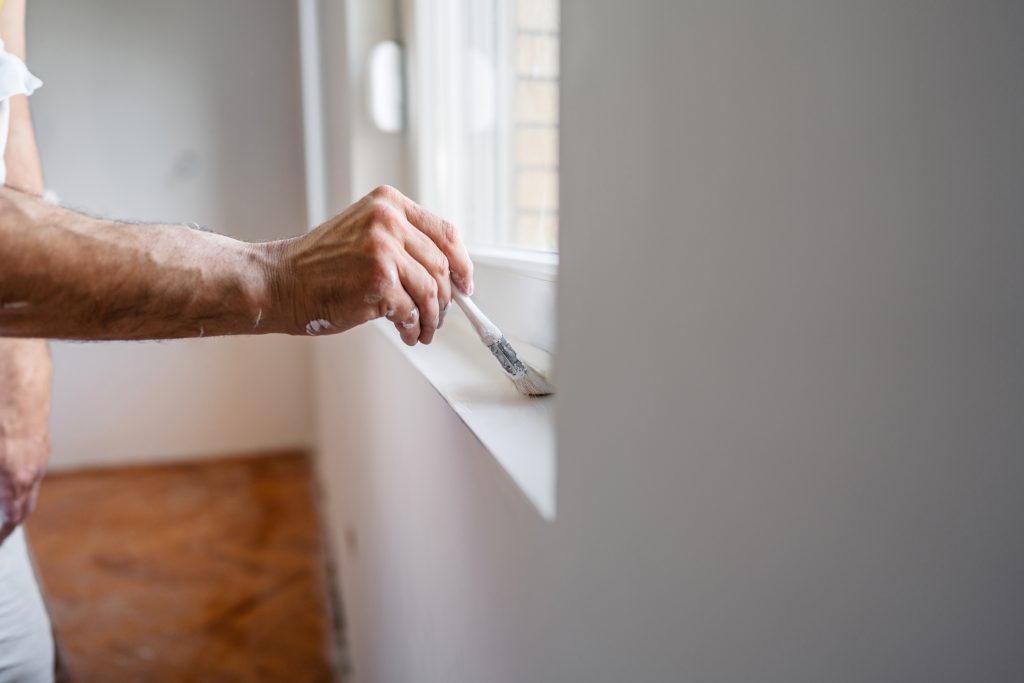
How to Match Your Wall Colors with Flooring and Furniture
25 April 2025 - Dow Brothers Painting LTD")
How Calgary Designers Use Color to Create Mood in Homes
12 May 2025
Earthy Elegance Takes the Lead
We’ve seen a growing interest in warm earth tones among Calgary homeowners this year. As a result, shades like terracotta, clay beige, and muted olive have taken center stage. These colors offer a grounded, calming feel to interiors. That is to say, they pair beautifully with natural wood finishes and organic materials.
We’ve helped many clients transform their living spaces with these rich, earthy hues. In addition, these colors are ideal for open-concept layouts, adding warmth without overpowering. You can find more details on our interior offerings through our full list of painting services in Calgary. Calgary homeowners are loving the balance these tones bring. Likewise, their timeless appeal makes them a safe long-term investment.
Deep Greens and Moody Blues Are Statement-Makers
We’ve noticed that bold, saturated greens and blues are becoming favorites in Calgary’s design circles. However, these shades are often best used as accent walls or in spaces like home offices or powder rooms. Deep forest green and navy offer elegance and depth that’s hard to match.
Consequently, many homeowners are choosing these darker tones to create cozy, sophisticated interiors. That is to say, pairing them with brass fixtures and matte finishes completes the upscale look. We’ve had great success using these colors in dining rooms and dens. Similarly, they complement vintage or mid-century furniture beautifully. You can explore how these tones work in practice when you contact us to schedule a consultation.
Neutrals Are Getting Softer and Creamier
Cool greys have had their moment, but now we’re seeing a shift toward warmer, creamy neutrals. Therefore, tones like almond, vanilla, and warm greige are appearing more frequently in new color palettes. These hues feel more inviting and versatile across all seasons.
To clarify, these aren’t your basic builder beiges. Instead, they have soft yellow or pink undertones that add dimension to a room. We’ve used these shades extensively in both modern and traditional homes. Moreover, they’re perfect for living rooms and bedrooms where comfort is key.
The Rise of Muted Pastels for Freshness
We’ve embraced pastels with a modern twist—think dusty rose, sage mint, and pale cornflower blue. However, these aren’t the sugary tones of the past. Today’s pastels are more muted and matte, which gives them a grown-up, sophisticated edge. These shades have become favorites in kitchens, nurseries, and creative spaces.
Above all, these colors bring light and life to spaces without feeling overwhelming. They work well with minimalist furniture and soft textiles. In the same vein, muted pastels are an ideal choice for spring or summer paint refreshes. We’ve completed several jobs recently where these subtle tones totally changed the mood of the room. If you’re unsure where to start, our Calgary painting experts can guide you through the selection process with ease.
Unexpected Color Pairings Are Gaining Popularity
We’ve seen more homeowners asking for bold combinations that feel custom and curated. For instance, pairing moss green with peach or mustard yellow with slate blue. On the other hand, this trend isn’t about clashing—it’s about contrast that creates harmony when balanced correctly.
As a result, we’re experimenting with split tones and color blocking. This adds visual interest and helps define spaces in open-concept homes. Most importantly, these combinations reflect personal style in a powerful way. During consultations, we always take time to understand your palette preferences and lifestyle needs.
Accent Ceilings and Painted Trim Are Trending
Ceilings and trim are no longer off-limits when it comes to color. We’ve painted dozens of ceilings in soft blue or even charcoal grey to add mood and drama. In other words, your ceiling doesn’t have to be white to make a space feel large or elegant.
Likewise, trim painted in complementary or contrasting shades adds sophistication. Homeowners are moving beyond simple white baseboards. Instead, they’re choosing off-black, navy, or even blush tones to frame their walls. We make sure these bold moves are always supported by the rest of the room’s palette. After that, the results often speak for themselves—a room feels entirely renewed.
Matte and Velvet Finishes Dominate 2025
Color isn’t the only thing that’s changing—finishes matter too. We’ve seen a major shift toward matte and velvet finishes, which give walls a luxurious, soft-touch look. However, these finishes do require more surface prep to achieve that flawless effect.
To clarify, a matte finish diffuses light beautifully and hides minor wall imperfections. This is especially helpful in older homes. In addition, these finishes feel more tactile and premium than traditional sheens. When applied correctly, they elevate even simple colors into something spectacular. You can speak with our Calgary paint team to explore which finishes best suit your home.
FAQs
What are the most popular wall colors in Calgary homes right now?
In 2025, earthy tones like clay beige, muted olive, and warm greige are topping the charts. These shades offer a calming, natural feel that works well across different styles and room types.
Can bold colors work in small rooms?
Yes, bold shades like navy or forest green can work beautifully in small rooms when used thoughtfully. For example, applying them to an accent wall can add depth without overwhelming the space.
Are neutral colors still trendy?
Absolutely. However, the neutrals of 2025 are warmer and creamier than past trends. Tones like almond and soft vanilla are replacing the cool greys of previous years.
Is matte paint a good option for busy households?
Matte paint can work in busy homes, especially if paired with durable formulations. It’s ideal for areas where light diffusion is important, though it may require touch-ups over time.
How do I choose a color palette for my home?
Start by considering your furniture, lighting, and personal style. You also can contact us for a color consultation so we can help you create a cohesive and modern palette.


