
Top 5 Ways to Make Small Rooms Look Bigger with Paint
16 April 2025
2025 Paint Color Trends Calgary Homeowners Are Loving
5 May 2025
Understanding the Relationship Between Color and Space
When I start planning any interior design project, one of the first things I think about is how the wall colors will interact with both the flooring and furniture. After all, every color affects how a room feels and functions. In other words, it’s not just about what looks good — it’s about what works together in harmony.
I always consider how light plays off each surface. For instance, darker floors paired with soft beige walls can give the space a grounded yet airy vibe. Therefore, I never overlook lighting when selecting color palettes. This type of coordination sets the stage for a beautiful and balanced room, whether you’re refreshing one room or your entire home.
Start with the Flooring as the Foundation
In my experience, flooring dictates the tone of the space. Whether it’s warm-toned wood, cool gray tile, or rich carpeting, the floor grounds the visual weight of the room. Consequently, I always treat it as the base reference point when picking a wall color.
For warm wood tones, I often recommend soft creams, muted greens, or even taupe to complement without clashing. Cool-toned flooring opens the door to grays, blues, and crisp whites. Above all, the goal is to create a transition that feels smooth, not jarring. That’s why choosing the right color family makes such a difference.
Coordinating Furniture and Walls Without Overcomplicating
I’ve found that once the flooring and walls are in sync, furniture becomes the bridge between the two. Upholstery and wood finishes either amplify or soften the overall look. That is to say, if your wall and floor tones differ, your furniture can help tie them together.
Neutral walls allow bold furniture to stand out, while colorful walls can complement simple furniture pieces. In addition, I often recommend matching undertones — warm with warm, cool with cool — to keep the visual flow consistent. I always test swatches in natural light before committing.
Contrast or Complement? Knowing What Works
Sometimes I love using contrast, and other times I prefer a complementary palette. It really depends on the feeling I want to evoke. However, it’s essential to not overdo it with extreme differences in tone or hue.
For example, if I have deep espresso floors, I might go with pale walls and mid-toned furniture to keep things from looking too stark. Likewise, pairing gray flooring with navy walls and white furniture can feel cohesive when done right. It’s about finding balance — not creating visual chaos.
Accent Features Can Guide Your Color Decisions
I always advise clients to look at more than just walls, floors, and large furniture. Trim, doors, and cabinets are just as important. To clarify, they can either elevate your design or become a mismatch that breaks the room’s unity.
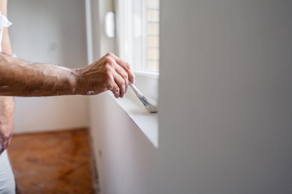
I recently painted trim and doors to match subtle tones in the flooring, which brought the whole space together. Most importantly, these elements help anchor your color scheme. If you’re unsure where to start, this trim and door painting guide is a great resource.
Keep Your Style in Mind
Personal style always comes first for me. I can offer all the tips in the world, but your home should reflect you. If your style leans rustic, warm earthy tones might suit you best. Similarly, minimalist styles often thrive with cooler neutrals and simple contrasts.
Modern styles allow for more bold combinations. For instance, a crisp black floor with a deep green accent wall and white trim can look stunning. Subsequently, knowing your style helps narrow choices quickly and effectively.
Paint Finishes and Their Impact on Appearance
I always say the finish is just as important as the color itself. Matte finishes hide flaws but absorb light, while satin or eggshell finishes add a subtle sheen. In the same vein, gloss finishes are ideal for trim but might be too intense for walls.
If you’re unsure what’s right for your space, I suggest exploring interior painting options that fit your light levels, room purpose, and daily use. Moreover, I’ve seen firsthand how finish choices impact the final feel of a room.
Using Cabinets as a Visual Anchor
Kitchens and bathrooms have another major color player: the cabinets. Cabinets aren’t just storage — they’re central to the color harmony of the room. For instance, white cabinets pair beautifully with nearly any color, while natural wood cabinets need more tailored tones.
When updating a space, I often suggest cabinet painting services that align with your wall and flooring palette. As a result, the room feels intentional and thoughtfully composed, not thrown together with competing elements.
Don’t Forget to Test Before You Commit
Even if everything looks great in theory, I always test paint colors before making a final decision. Light, room size, and furniture arrangement all impact how a color looks on the wall. After that, I view the swatches at different times of day to see how they shift.
Paint chips at the store aren’t enough. I use large samples or peel-and-stick swatches to truly assess tone. Most importantly, this approach saves time, money, and regret later. It’s one of the easiest ways to ensure a harmonious result.
Professional Help Brings It All Together
When it feels overwhelming to align floors, walls, and furniture, I always recommend bringing in professionals like Dow Brothers Painting LTD. Their guidance makes decision-making faster and more accurate. In addition, their work delivers quality you can count on long after the paint dries.
To start planning your perfect room palette, feel free to Contact Us. In conclusion, getting expert insight can turn a stressful project into a rewarding design journey with long-lasting satisfaction.
FAQs
How do I know which wall color matches my flooring best?
I always look at the undertones in the flooring. If the floor has warm tones, I match it with warm paint colors. Similarly, cool-toned flooring pairs well with cool paint shades. I recommend testing a few swatches in natural light to make a confident decision.
What if my furniture and flooring clash in color?
In that case, I use the wall color as a bridge to harmonize both. For example, I might pick a neutral or mid-tone color that complements both elements. Using accessories like rugs or throws in similar tones also helps connect the space.
Can I mix different wood tones in my space?
Yes, you can — but with intention. I aim to include a dominant wood tone, then use others in smaller amounts. On the other hand, matching the undertones (cool or warm) makes the mix feel more deliberate and cohesive.
Should trim and wall colors always match?
Not necessarily. I often paint trim in a contrasting tone for added depth and definition. However, if you want a more seamless look, using the same shade in a different finish (gloss for trim, matte for walls) works beautifully too.
Is it worth hiring professionals for paint matching and coordination?
Absolutely. I find that professionals like Dow Brothers Painting LTD bring valuable expertise that saves time and avoids costly mistakes. Consequently, working with experts results in a polished and satisfying finish every time.


